
The metrics shared in this portfolio are intended to illustrate the impact of design decisions. All sensitive data has been handled with respect for confidentiality.

Designed and built in Figma by Davide Pisauri
VISTA · 2024 · web
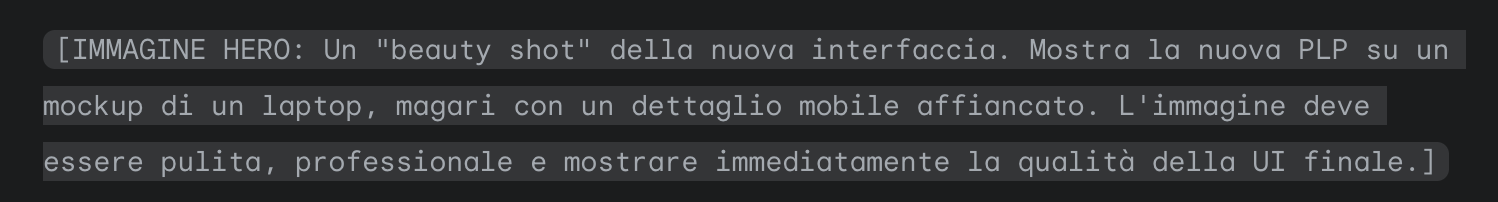
Rebuilding PLP navigation for faster product discovery
At Vista, a hidden navigation system was causing users to abandon their journey. This is the story of how I used prototypes and data to defend a simpler, clearer user experience, leading to a significant increase in product discovery and a measurable lift in the purchase funnel.
+18%
Product Page Visits
+22%
Navigation Engagement
-12%
Early Backtracking
THE CONTEXT
A powerful navigation system, hidden in plain sight
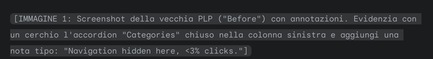
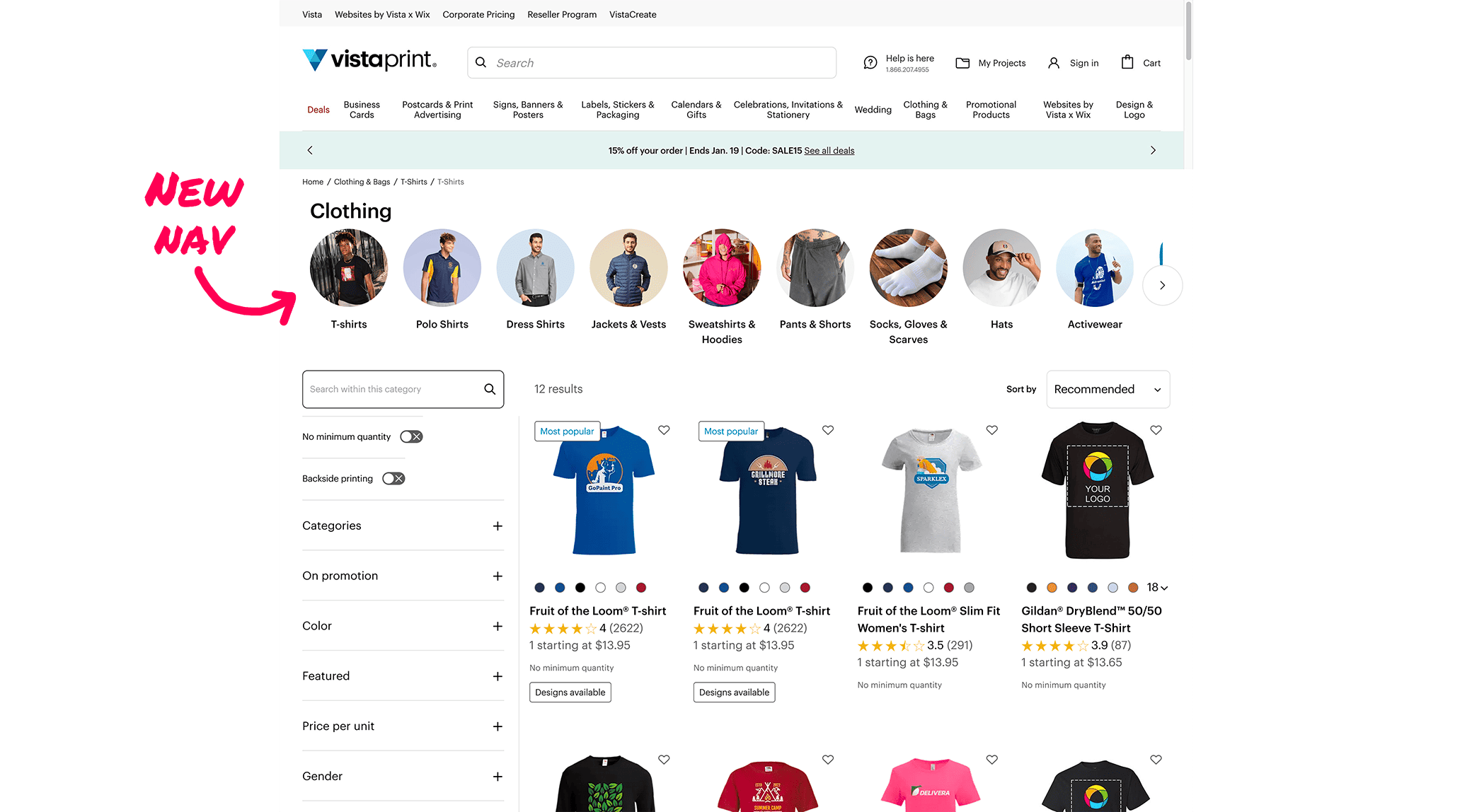
Vista’s vast e-commerce catalog is structured across three levels of product categories. A navigation system to move between these levels existed, but it was buried inside a collapsed accordion, hidden away from the user's main flow.
Users weren't finding the path to more specific products, and the data showed it.
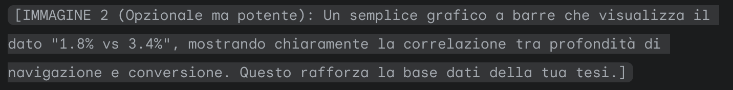
Analysis revealed that the existing navigation was used in less than 3% of all PLP sessions. This was a critical missed opportunity, as we had clear funnel data showing that the deeper a user went into the category hierarchy, the more likely they were to convert. The add-to-cart rate on a level 3 page was nearly double that of a level 2 page (3.4% vs 1.8%).
My goal was to shift the conversation from "what color do I like?" to "what lens do I need?"
MY ROLE
Facilitating decisions with evidence
As the sole Senior Product Designer for Costa del Mar within EssilorLuxottica, I owned the design process end-to-end. I partnered with research, business, and IT stakeholders to frame the problem, define a data-driven strategy, and deliver a solution that was desirable for users, technically feasible, and valuable for the business.
THE CHALLENGE
Resisting the temptation to mix navigation with filters
The main challenge wasn't redesigning the UI, but defending the clarity of the user's mental model. Several stakeholders pushed to include filter-like pages (e.g., “Long sleeves,” “Express shipping”) directly within the new category navigation. My hypothesis was that this would blur the line between exploration ("what kind of products are there?") and refinement ("show me specific versions of this product").
Instead of endless debates, I built Figma prototypes of both approaches. Through unmoderated tests, the data was unequivocal: mixing filters into the main navigation path caused confusion and increased friction. Presenting these findings allowed us to align all stakeholders around a simpler, more effective model.
THE SOLUTION
Guiding decisions, not just choices
The final solution was built on the principle of separating exploration from refinement, giving each a clear and visible home.
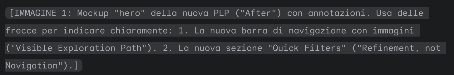
- A visible navigation bar for explorationI designed a new, always-visible navigation bar placed directly below the PLP header. This bar uses representative images and clear labels to guide users to the next level of subcategories. On mobile, this gracefully adapts into a horizontal carousel.
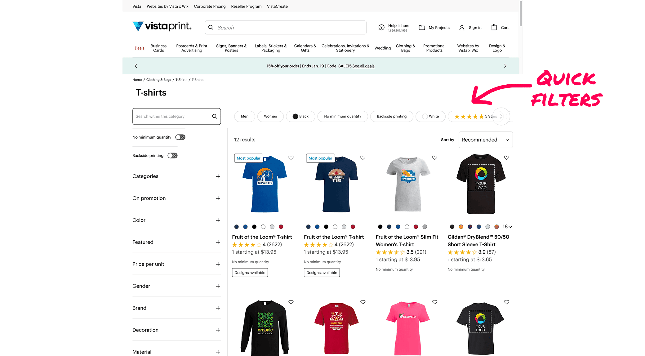
- Quick filters for refinementTo address the stakeholder need, I introduced a dedicated "Quick Filters" section above the product grid. This allows users to easily narrow down products within the current category without confusing it with the primary navigation path.

THE IMPACT
Less confusion, more product discovery
After a successful pilot test, the new design was rolled out globally, delivering a clear and positive impact on user behavior and key business metrics.
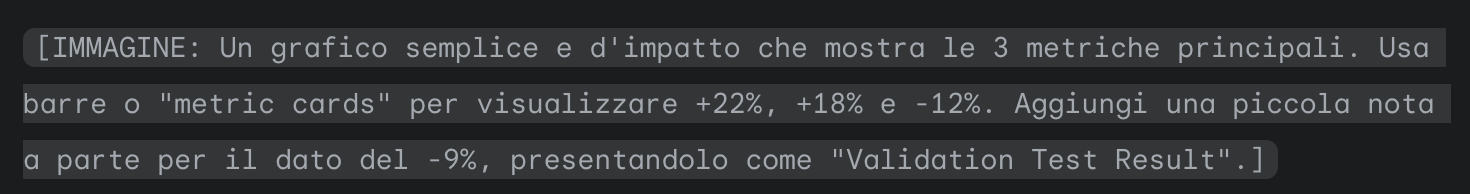
- +22% engagement with the category navigation system.
- +18% more PDP visits originating from PLPs, indicating that users were successfully moving deeper into the funnel.
- -12% early backtracking between categories, a strong signal that users felt more confident in their navigation choices.
Months later, a separate experiment confirmed our initial findings, showing a -9% negative impact on conversion compared to our clear, separated model. It was the ultimate proof that clarity outperforms complexity.
KEY TAKEAWAYS
My approach to senior-level design
This project reinforced three core principles that drive my work:
- Prototypes replace argumentsA tangible prototype put in front of users and stakeholders provides concrete evidence, shortens debate cycles, and accelerates alignment.
- Clarity drives discoveryBy defending a clean structure and separating navigation from filters, we made product exploration intuitive, which directly led to measurable gains.
- Conversion lives in the detailsA seemingly small component like PLP navigation can have a massive downstream impact on user confidence and KPIs. True product discovery is won or lost in these structural details.
KEY TAKEAWAYS
My approach to senior-level design
If you found this e-commerce optimization project interesting, see how I applied a similar data-driven approach to streamline the most critical step of the funnel.
VISTA
Turning internal debate into data-driven design
DESIGN LEADERSHIP
EVIDENCE-BASED DESIGN
PROCESS OPTIMIZATION

Or, see all my work

ABOUT ME
WORKS
CONTACTS
VISTA · 2024 · web
Rebuilding PLP navigation for faster product discovery
At Vista, a hidden navigation system was causing users to abandon their journey. This is the story of how I used prototypes and data to defend a simpler, clearer user experience, leading to a significant increase in product discovery and a measurable lift in the purchase funnel.
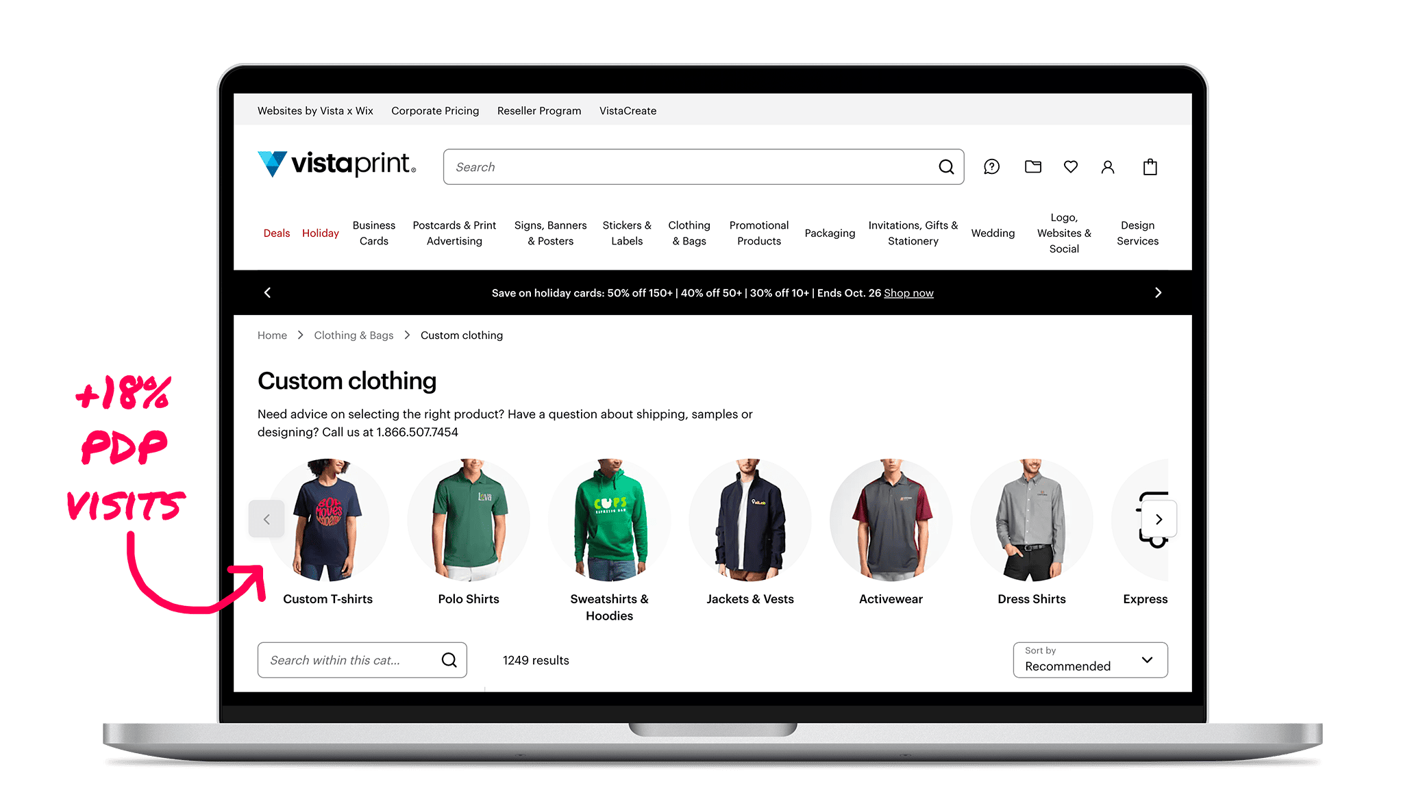
+18%
PDP Visits
+22%
Navigation Engagement
-12%
Early Backtracking
THE CONTEXT
A powerful navigation system, hidden in plain sight
Vista’s vast e-commerce catalog is structured across three levels of product categories. A navigation system to move between these levels existed, but it was buried inside a collapsed accordion, hidden away from the user's main flow.
Users weren't finding the path to more specific products, and the data showed it.
Analysis revealed that the existing navigation was used in less than 3% of all PLP sessions. This was a critical missed opportunity, as we had clear funnel data showing that the deeper a user went into the category hierarchy, the more likely they were to convert. The add-to-cart rate on a level 3 page was nearly double that of a level 2 page (3.4% vs 1.8%).
The original PLP navigation
My conviction was that navigation should help users explore possibilities, not refine them.
MY ROLE
Facilitating decisions with evidence
I operated within a triad model, partnering with a Product Manager and an Engineering Lead. My role was to lead the design process, but more importantly, to use prototypes and unmoderated user tests to transform debates based on opinions into decisions backed by clear, indisputable evidence.
THE CHALLENGE
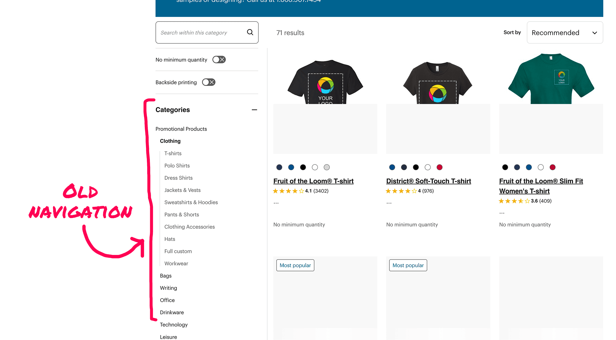
Resisting the temptation to mix navigation with filters
The main challenge wasn't redesigning the UI, but defending the clarity of the user's mental model. Several stakeholders pushed to include filter-like pages (e.g., “Long sleeves,” “Express shipping”) directly within the new category navigation. My hypothesis was that this would blur the line between exploration ("what kind of products are there?") and refinement ("show me specific versions of this product").
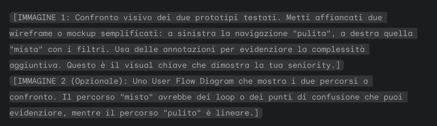
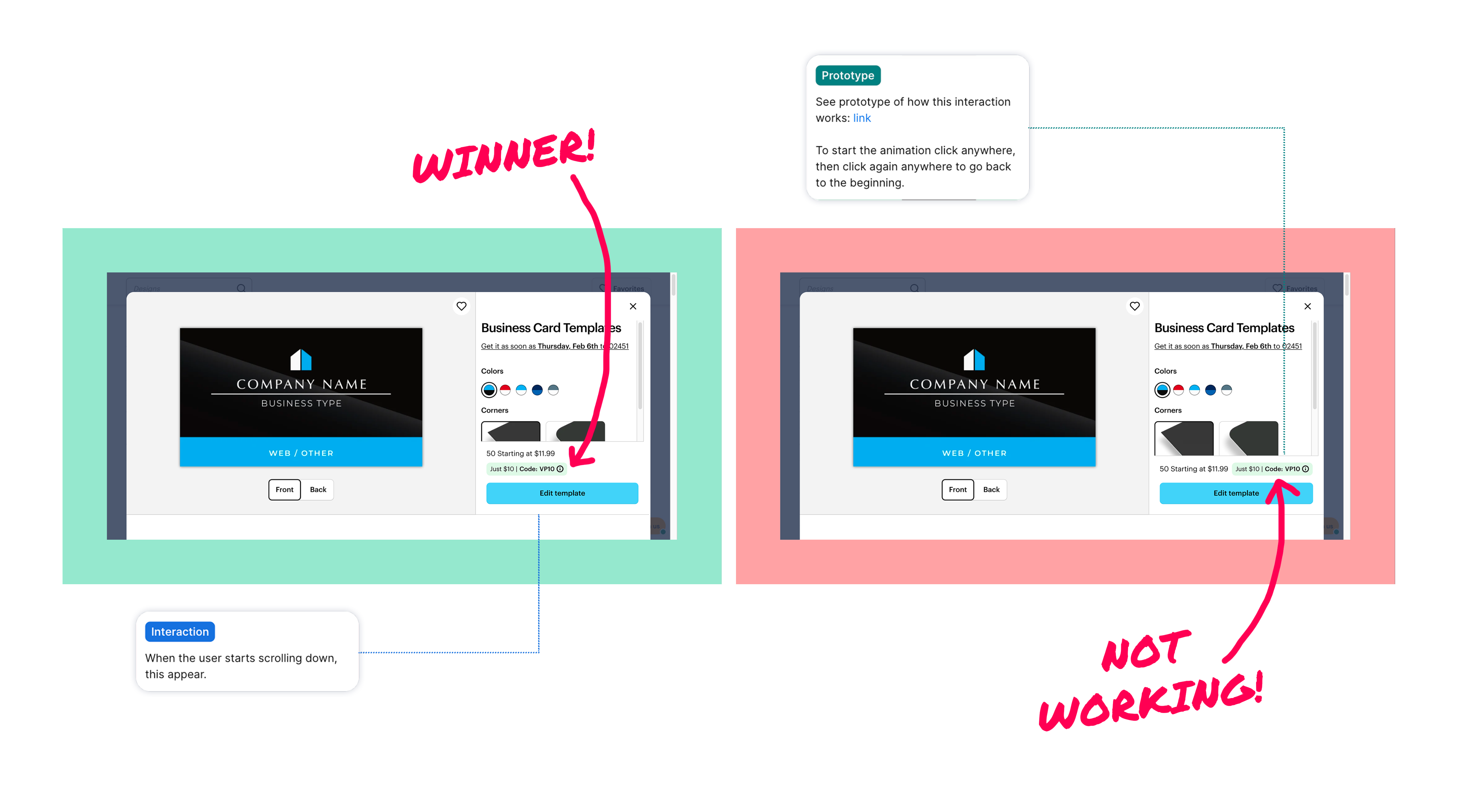
Instead of endless debates, I built Figma prototypes of both approaches. Through unmoderated tests, the data was unequivocal: mixing filters into the main navigation path caused confusion and increased friction. Presenting these findings allowed us to align all stakeholders around a simpler, more effective model.
The prototype highlighting the confusion between navigation links and filters
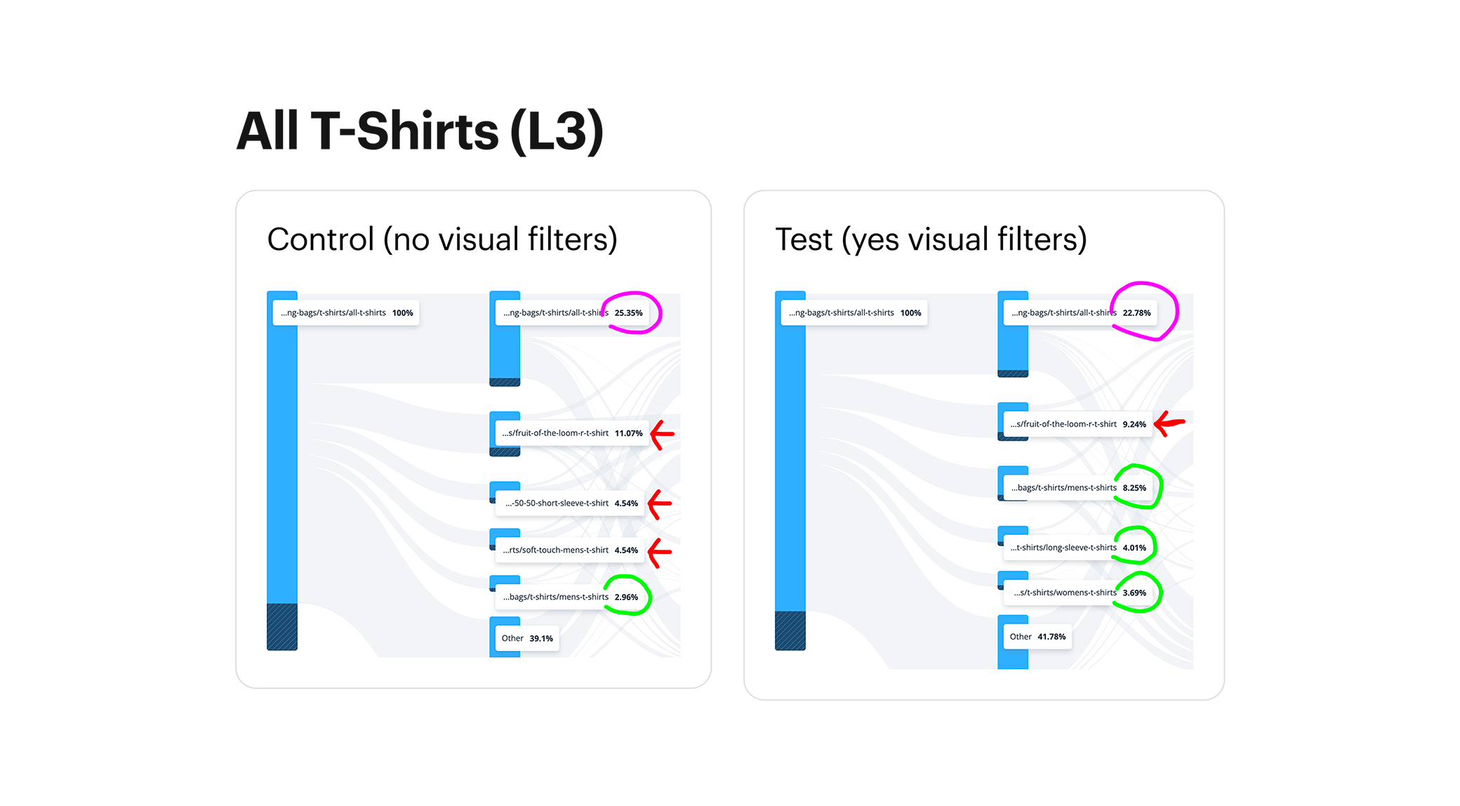
L3 pages equipped with Visual Filters showed a decrease in traffic to the Product Details Page (PDP) [circle]
in favor of more subcategory exploration [arrow].
THE SOLUTION
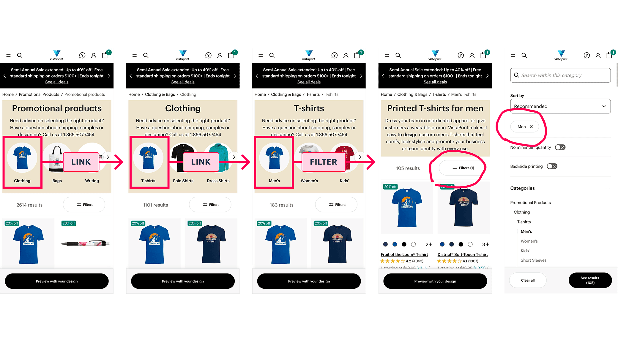
Separating to guide, not to overwhelm
The final solution was built on the principle of separating exploration from refinement, giving each a clear and visible home.
- A visible navigation bar for explorationI designed a new, always-visible navigation bar placed directly below the PLP header. This bar uses representative images and clear labels to guide users to the next level of subcategories. On mobile, this gracefully adapts into a horizontal carousel.
- Quick filters for refinementTo address the stakeholder need, I introduced a dedicated "Quick Filters" section above the product grid. This allows users to easily narrow down products within the current category without confusing it with the primary navigation path.
The redesigned PLP navigation, featuring visual links to guide users to subcategories
The proposed Quick Filters, designed to separate refinement from the main navigation
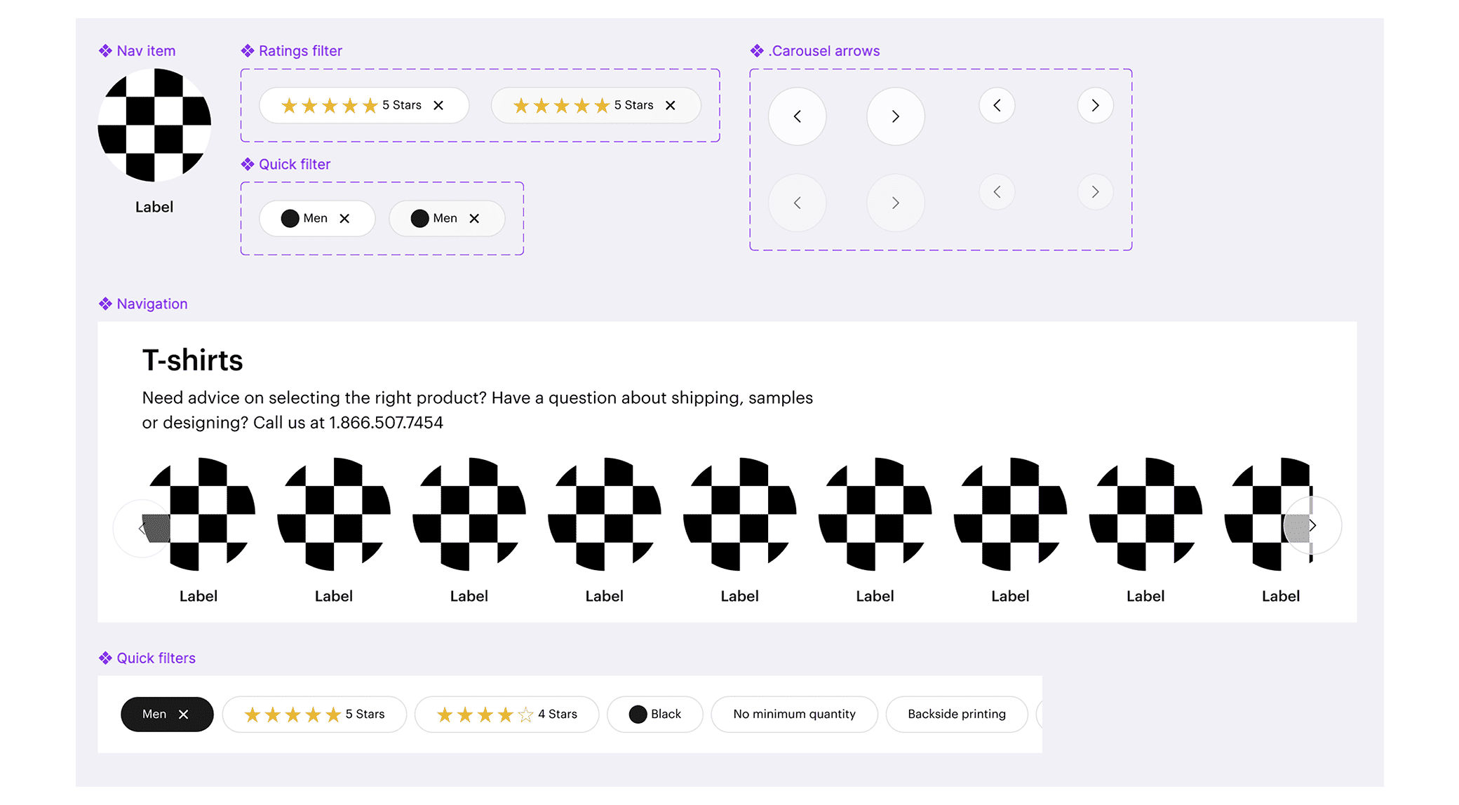
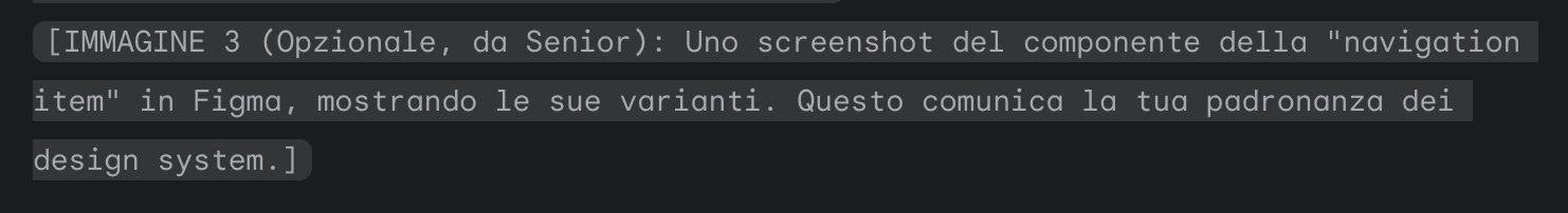
A selection of components designed in Figma for the project
THE IMPACT
Less confusion, more product discovery
After a successful pilot test, the new design was rolled out globally, delivering a clear and positive impact on user behavior and key business metrics.
- +22% engagement with the category navigation system.
- +18% more PDP visits originating from PLPs, indicating that users were successfully moving deeper into the funnel.
- -12% early backtracking between categories, a strong signal that users felt more confident in their navigation choices.
Months later, a separate experiment confirmed our initial findings, showing a -9% negative impact on conversion compared to our clear, separated model. It was the ultimate proof that clarity outperforms complexity.
KEY TAKEAWAYS
My approach to senior-level design
This project reinforced three core principles that drive my work:
- Prototypes replace argumentsA tangible prototype put in front of users and stakeholders provides concrete evidence, shortens debate cycles, and accelerates alignment.
- Clarity drives discoveryBy defending a clean structure and separating navigation from filters, we made product exploration intuitive, which directly led to measurable gains.
- Conversion lives in the detailsA seemingly small component like PLP navigation can have a massive downstream impact on user confidence and KPIs. True product discovery is won or lost in these structural details.
WHAT'S NEXT?
Continue the story
If you liked how I used prototypes and testing to solve a design problem, see how I used the same tools to solve a complex stakeholder alignment challenge.
VISTA
Turning internal debate into data-driven design
How evidencebased design turned stakeholder debate into measurable progress
DESIGN LEADERSHIP
EVIDENCE-BASED DESIGN
PROCESS OPTIMIZATION
Or, see all my work