
Vista · 2025 · web
Turning internal debate into data-driven design
Stakeholder debate and user confusion were causing Vista’s critical template journey to fail. I led a design process that replaced subjective opinions with objective data from A/B and usability tests. This evidence-based approach aligned the teams, built trust, and boosted the studio conversion rate by 9.1%.
+18%
Made-it Rate to Studio
+125%
Quick View Engagement
+36%
Template CTR
THE CONTEXT
A crucial user journey, plagued by a lack of confidence
For Vista's small business customers, the journey from choosing a product to personalizing a template is the most critical part of the funnel. This flow happens across three key pages: the Gallery (browsing templates), the Quick View (template details), and the Studio (the editor).
However, users were dropping off at an alarming rate. Weak structure and a lack of clarity in the Gallery and Quick View caused confusion and hesitation, preventing them from confidently entering the Studio to finalize their purchase.
My role wasn't just to design the solution, but to design a process that could turn subjective opinions into objective, data-backed decisions.
MY ROLE
Architect of an evidence-based process
Working in a triad with a Product Manager and an Engineering Lead, I owned the design direction for this critical journey. My primary responsibility was to ensure that every strategic decision was validated with evidence, effectively acting as the architect of a process that would systematically replace assumptions with data.
THE CHALLENGE
Resisting the temptation to mix navigation with filters
After an initial design sprint defined our vision, the roadmap triggered significant doubts from stakeholders. I treated each challenge as an opportunity to build trust through a transparent, evidence-based approach.
1.
The Overlay Debate: "Why change a consistent pattern?"
Our proposal to use a centered overlay for the Quick View was met with resistance due to concerns about inconsistency with the Design System. Instead of debating, I pushed for an A/B test comparing the side panel to the new overlay. The result: the overlay drove +1.1% conversion and higher engagement, earning stakeholder buy-in and a new, approved component in our Design System.
2.
The Visibility Gap: "Have you explored all the options?"
Design reviews were slow because stakeholders lacked visibility into our explorations and rationale. I tackled this by creating a "single source of truth" in Figma: I color-coded options, annotated pros and cons, and documented feedback directly in the file. This transparency transformed our reviews from debates into efficient alignment sessions.
3.
The Usability Concerns: "Will this be harder to use?"
As the solution took shape, valid usability questions emerged. I designed and led three targeted unmoderated tests to answer specific stakeholder concerns about scrolling, CTA persistence, and template switching. The results were clear: the usability was strong, and the insights allowed us to move forward with confidence, turning potential blockers into validated features.
THE SOLUTION
The outcome of a shared, evidence-based journey
The final design wasn't just "my" solution; it was the logical outcome of a collaborative and validated process. We introduced a focused, centered overlay for the Quick View, which housed a new section for exploring similar templates and featured a persistent CTA that tested provenly better for user confidence. Every key element of the final UI was a direct answer to a question we had tested and validated together.
THE IMPACT
More than metrics: A cultural shift in design maturity
- The quantitative results were staggering:
- +9.1% Made-it Rate from Gallery to Studio, our primary conversion metric.
- +125% engagement within the Quick View.
- +36% template click-through rate.
The project was a resounding success, not only in its exceptional business results but in its lasting cultural impact on the organization.
But the real success was cultural. By demonstrating the power of a transparent, evidence-based process, we shifted the stakeholder mindset from skepticism to support. The project resulted in a new, shared component standard in the Design System, raising the bar for how design decisions would be made in the future.
KEY TAKEAWAYS
My approach to senior-level design
This project solidified my belief that a Senior Designer's greatest impact comes from shaping the process, not just the pixels.
- Transparency accelerates progress.Making design explorations visible and annotated in Figma doesn't just build trust, it makes the entire decision-making process faster and more efficient for everyone.
- Evidence wins over opinion.A well-designed test is the most powerful tool for alignment. Proof replaces subjective arguments with measurable direction and creates unstoppable momentum.
- Design maturity is a cultural outcome.The strongest results are not just better metrics, but a better way of working. Design work that raises the maturity of an organization scales far beyond a single project.


ABOUT ME
WORKS
CONTACTS
Vista · 2025 · web
Turning internal debate into data-driven design
Stakeholder debate and user confusion were causing Vista’s critical template journey to fail. I led a design process that replaced subjective opinions with objective data from A/B and usability tests. This evidence-based approach aligned the teams, built trust, and boosted the studio conversion rate by 9.1%.
+9.1%
Made-it Rate to Studio
+125%
Quick View Engagement
+36%
Template CTR
THE CONTEXT
A crucial user journey, plagued by a lack of confidence
For Vista's small business customers, the journey from choosing a product to personalizing a template is the most critical part of the funnel. This flow happens across three key pages: the Gallery (browsing templates), the Quick View (template details), and the Studio (the editor).
However, users were dropping off at an alarming rate. Weak structure and a lack of clarity in the Gallery and Quick View caused confusion and hesitation, preventing them from confidently entering the Studio to finalize their purchase.
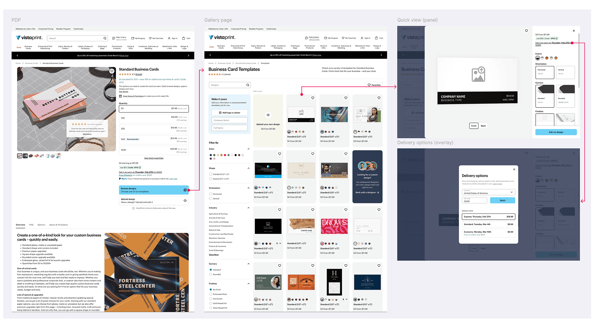
The original user flow from the PDP to the old Quick View
My role wasn't just to design the solution, but to design a process that could turn subjective opinions into objective, data-backed decisions.
MY ROLE
Architect of an evidence-based process
Working in a triad with a Product Manager and an Engineering Lead, I owned the design direction for this critical journey. My primary responsibility was to ensure that every strategic decision was validated with evidence, effectively acting as the architect of a process that would systematically replace assumptions with data.
THE CHALLENGE
Three doubts, three proofs: Earning stakeholder trust
After an initial design sprint defined our vision, the roadmap triggered significant doubts from stakeholders. I treated each challenge as an opportunity to build trust through a transparent, evidence-based approach.
1.
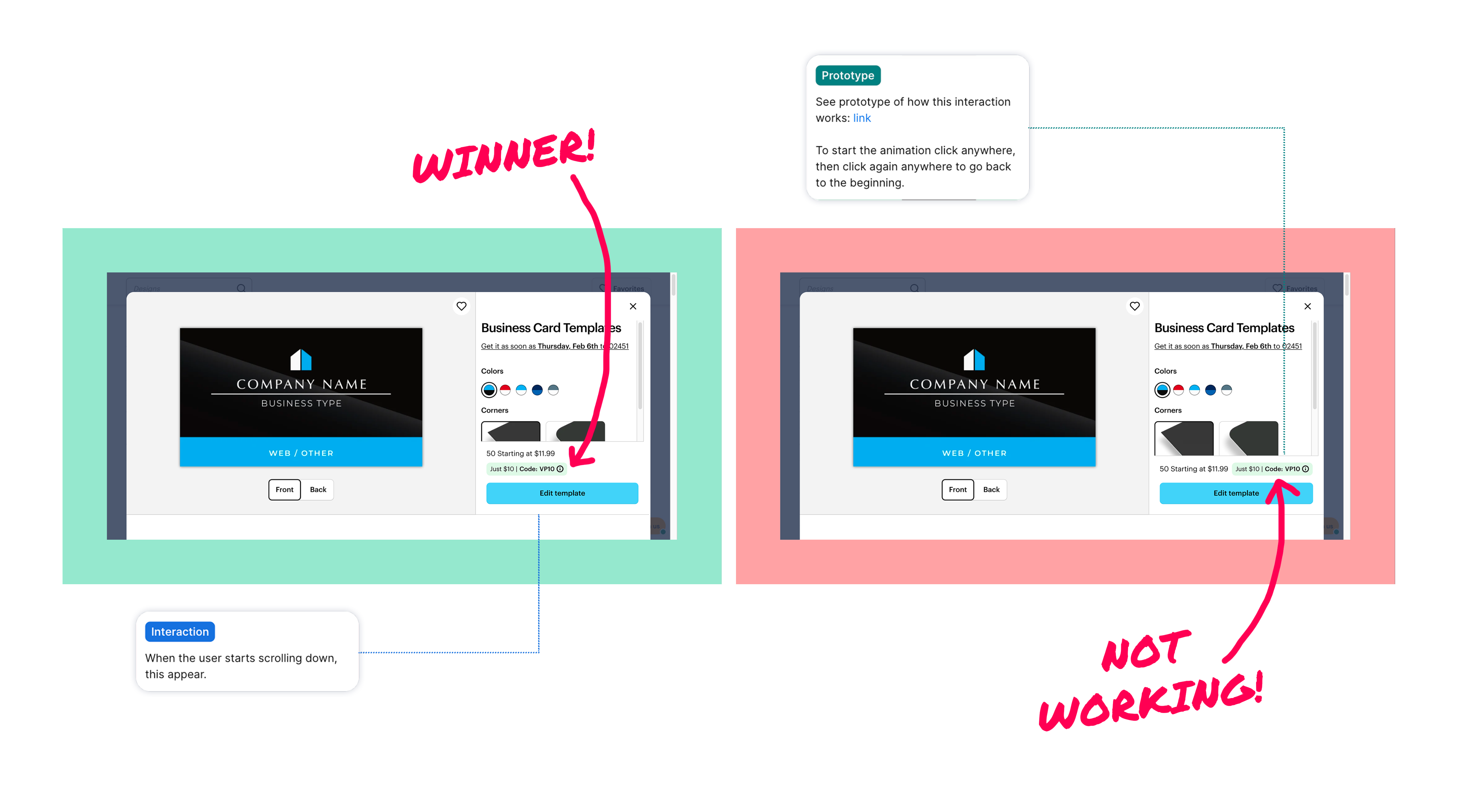
The Overlay Debate: "Why change a consistent pattern?"
Our proposal to use a centered overlay for the Quick View was met with resistance due to concerns about inconsistency with the Design System. Instead of debating, I pushed for an A/B test comparing the side panel to the new overlay. The result: the overlay drove +1.1% conversion and higher engagement, earning stakeholder buy-in and a new, approved component in our Design System.
The original Quick View, which appeared as a right-side panel

The redesigned Quick View, implemented as a centered overlay
2.
The Visibility Gap: "Have you explored all the options?"
Design reviews were slow because stakeholders lacked visibility into our explorations and rationale. I tackled this by creating a "single source of truth" in Figma: I color-coded options, annotated pros and cons, and documented feedback directly in the file. This transparency transformed our reviews from debates into efficient alignment sessions.
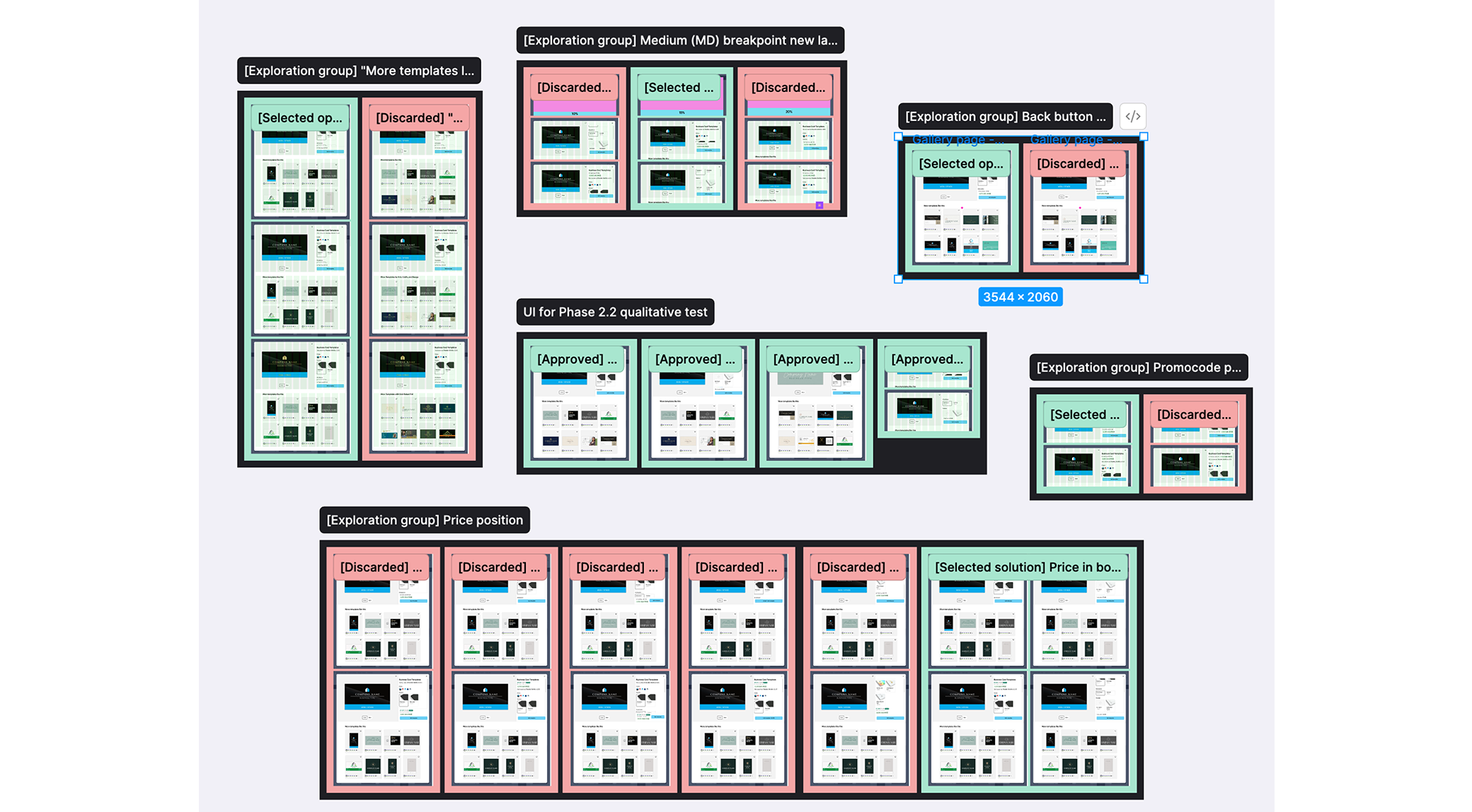
The Figma framework used to document explorations and create transparency around design decisions
3.
The Usability Concerns: "Will this be harder to use?"
As the solution took shape, valid usability questions emerged. I designed and led three targeted unmoderated tests to answer specific stakeholder concerns about scrolling, CTA persistence, and template switching. The results were clear: the usability was strong, and the insights allowed us to move forward with confidence, turning potential blockers into validated features.
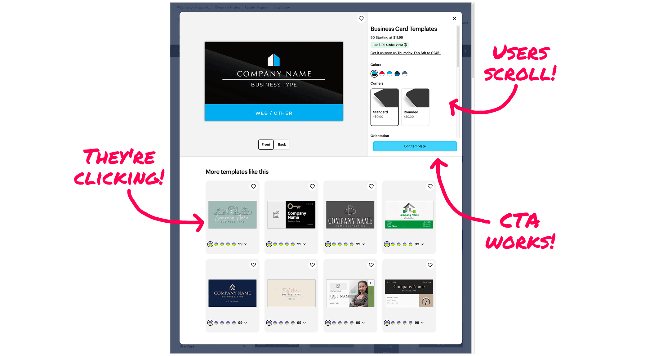
The usability test results that validated every key interaction and resolved stakeholder concerns
THE SOLUTION
The outcome of a shared, evidence-based journey
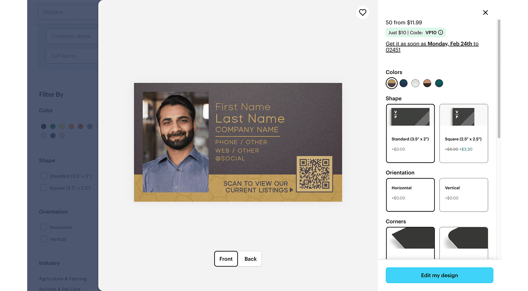
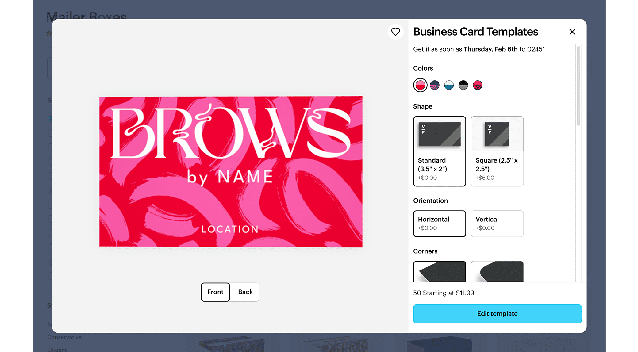
The final design wasn't just "my" solution; it was the logical outcome of a collaborative and validated process. We introduced a focused, centered overlay for the Quick View, which housed a new section for exploring similar templates and featured a persistent CTA that tested provenly better for user confidence. Every key element of the final UI was a direct answer to a question we had tested and validated together.
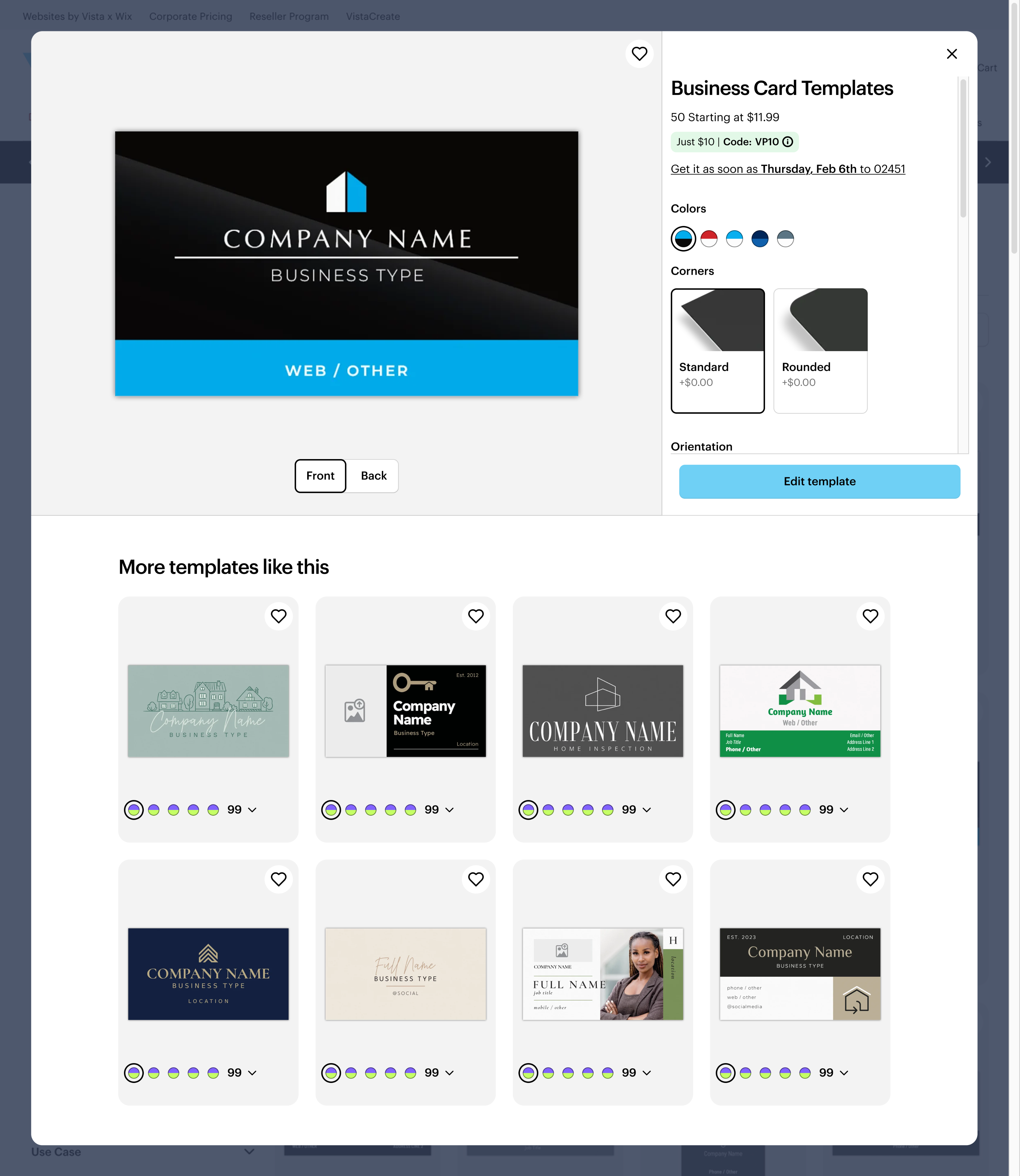
The final, validated UI for the redesigned Quick View overlay
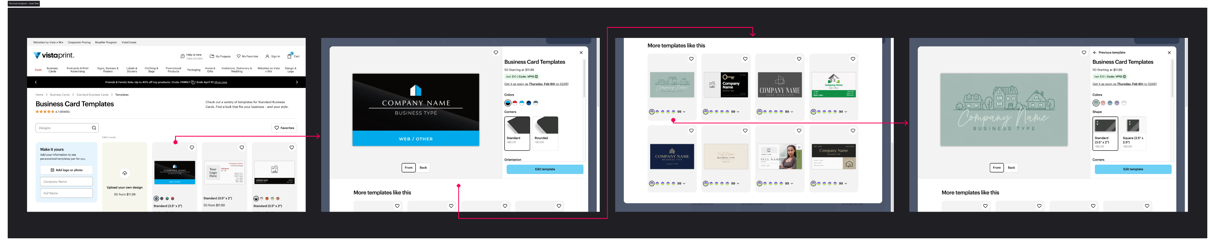
The new template navigation flow, allowing users to switch designs without leaving the Quick View
THE IMPACT
More than metrics: A cultural shift in design maturity
The project was a resounding success, not only in its exceptional business results but in its lasting cultural impact on the organization.
The quantitative results were staggering:
- +9.1% Made-it Rate from Gallery to Studio, our primary conversion metric.
- +125% engagement within the Quick View.
- +36% template click-through rate.
But the real success was cultural. By demonstrating the power of a transparent, evidence-based process, we shifted the stakeholder mindset from skepticism to support. The project resulted in a new, shared component standard in the Design System, raising the bar for how design decisions would be made in the future.
KEY TAKEAWAYS
My approach to senior-level design
This project solidified my belief that a Senior Designer's greatest impact comes from shaping the process, not just the pixels.
- Transparency accelerates progress.Making design explorations visible and annotated in Figma doesn't just build trust, it makes the entire decision-making process faster and more efficient for everyone.
- Evidence wins over opinion.A well-designed test is the most powerful tool for alignment. Proof replaces subjective arguments with measurable direction and creates unstoppable momentum.
- Design maturity is a cultural outcome.The strongest results are not just better metrics, but a better way of working. Design work that raises the maturity of an organization scales far beyond a single project.
WHAT'S NEXT?
Continue the story
If you valued my work on building foundational systems, see how I tackled a completely different challenge: redesigning a post-purchase service experience.
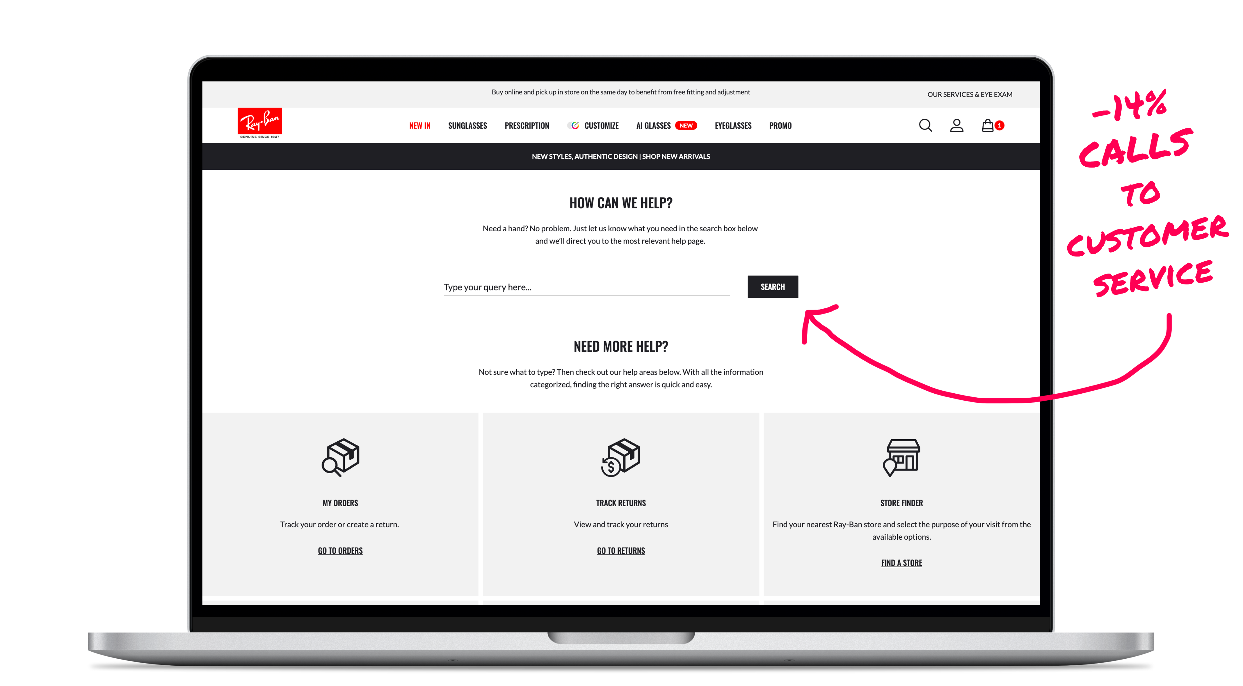
RAY-BAN
Designing a self-service journey to empower customers
How an intent-based Help Center reduced call volume and improved autonomy
SERVICE DESIGN
INFORMATION ARCHITECTURE
POST-PURCHASE UX
Or, see all my work