
The metrics shared in this portfolio are intended to illustrate the impact of design decisions. All sensitive data has been handled with respect for confidentiality.

Designed and built in Figma by Davide Pisauri
ray-ban · 2020 · web
Designing a self-service journey to empower customers
Ray-Ban's customer service was overloaded with calls for issues users could solve themselves. I led the redesign of the support experience, transforming it from a reactive call center into a proactive self-service ecosystem. By partnering with the Head of Customer Service to analyze user intents, we delivered a new, clear hub that significantly reduced support requests and empowered users to find solutions on their own.

-14%
Customer Service Requests
+9%
Autonomous Returns
THE CONTEXT
A support system overloaded with solvable problems
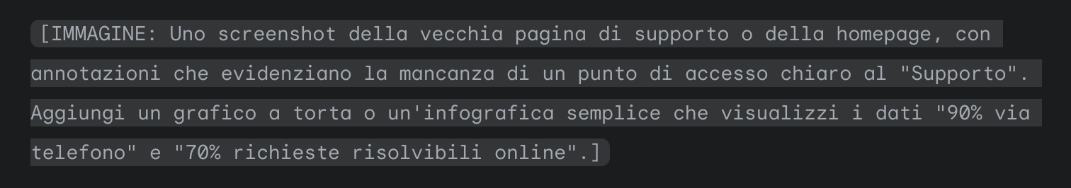
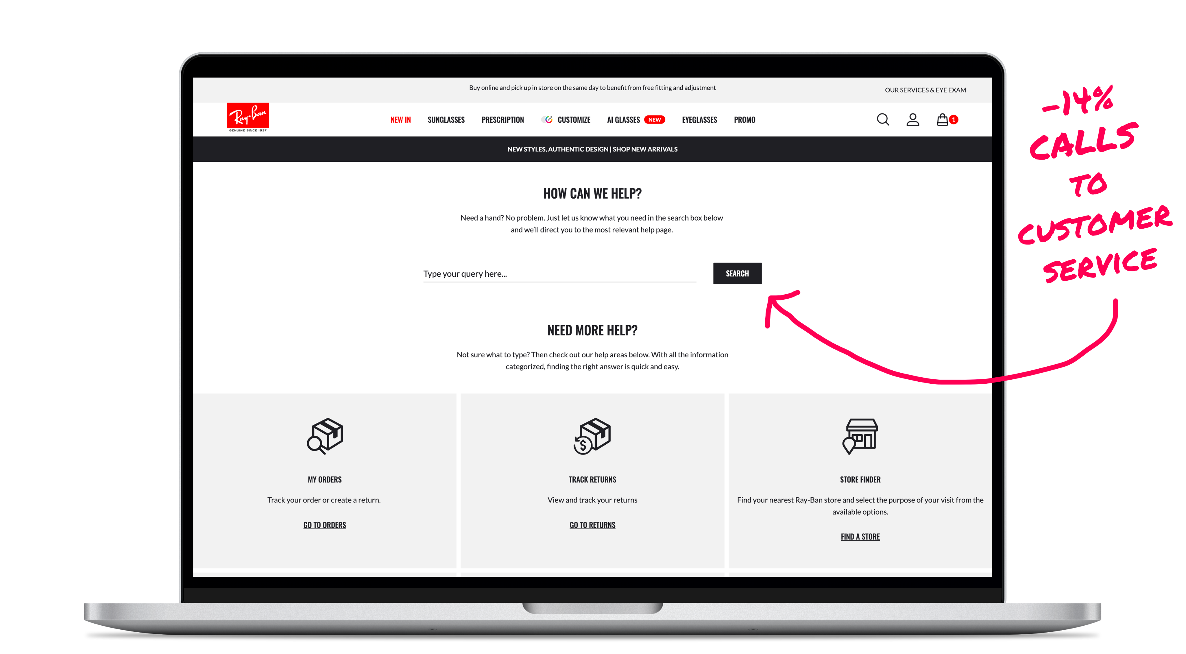
The post-purchase experience is fundamental for a brand like Ray-Ban. However, the customer service team was under immense pressure. An internal analysis revealed a critical inefficiency: 90% of all support requests arrived via phone, and a staggering 70% of those calls were for tasks users could have completed themselves, such as tracking an order or starting a return.
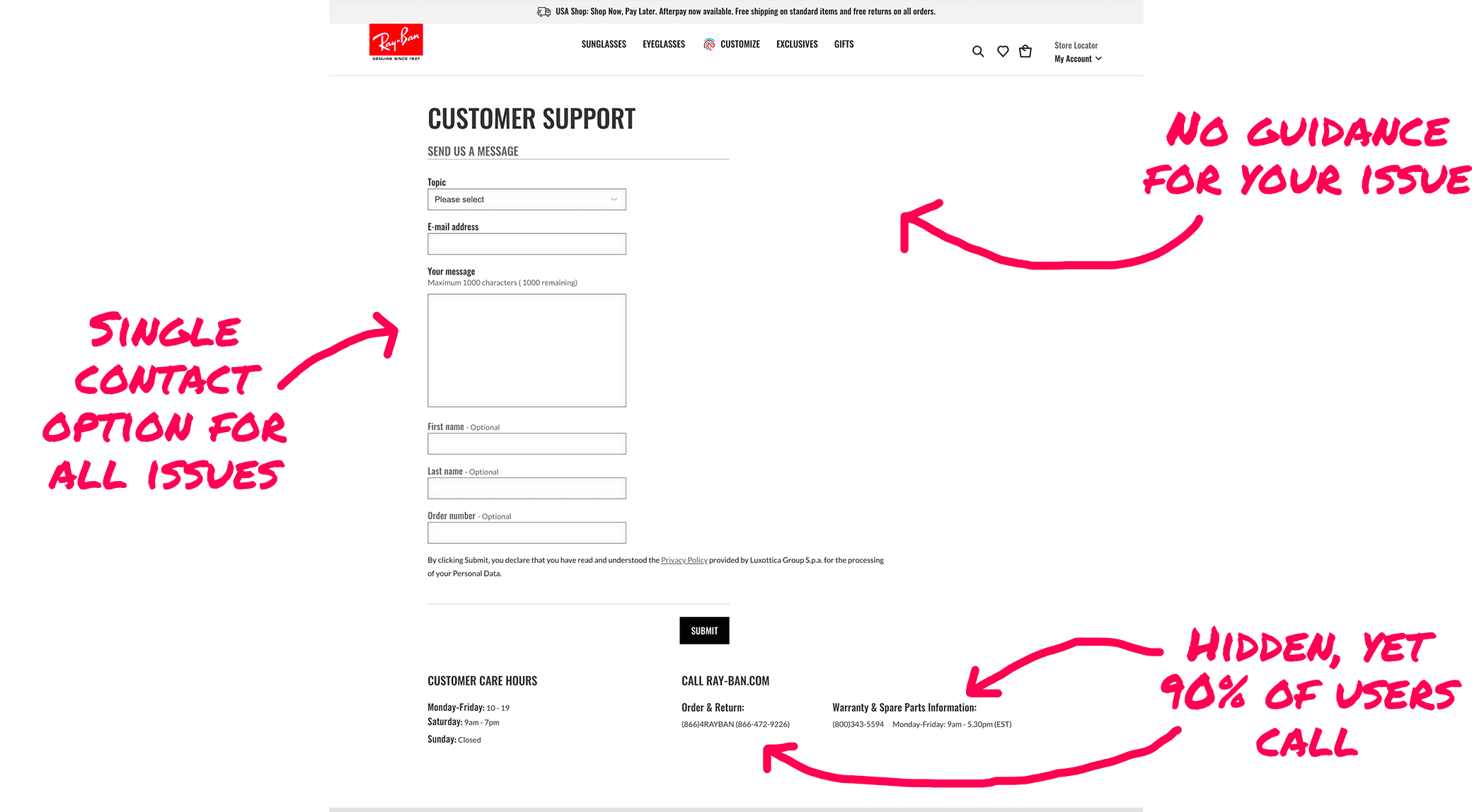
This created a negative loop: long wait times for customers and rising operational costs for the business. The existing online help tools were simply not visible, clear, or effective enough to break this cycle.
Our mission was to design for the user's intent, not the company's org chart.
MY ROLE
Turning analysis into actionable design solutions
As the Product Designer on this project, my role was to act as a strategic bridge. I worked in close partnership with the Head of Ray-Ban's Customer Service to dive deep into the real-world problems their team was facing. My responsibility was to translate these operational pain points and user intents into a clear information architecture and an intuitive interface that could effectively deflect routine requests and empower users to help themselves.
THE CHALLENGE
Three doubts, three proofs: Earning stakeholder trust
From call center data to a clear design strategy
Our approach was rooted in understanding the "why" behind every customer contact. We followed a three-step process to build our solution from the ground up:
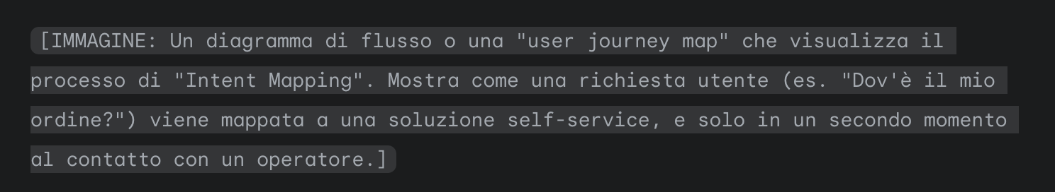
- Intent Mapping: I collaborated with the Customer Service team to analyze and categorize the top contact reasons. This allowed us to map each user problem to the most efficient solution, whether it was a self-service tool or direct contact with an agent.
- Content & Flow Audit: I inventoried all existing support pages, FAQs, and self-service tools to identify gaps and inconsistencies. The goal was to consolidate scattered information into a single, coherent Help Center.
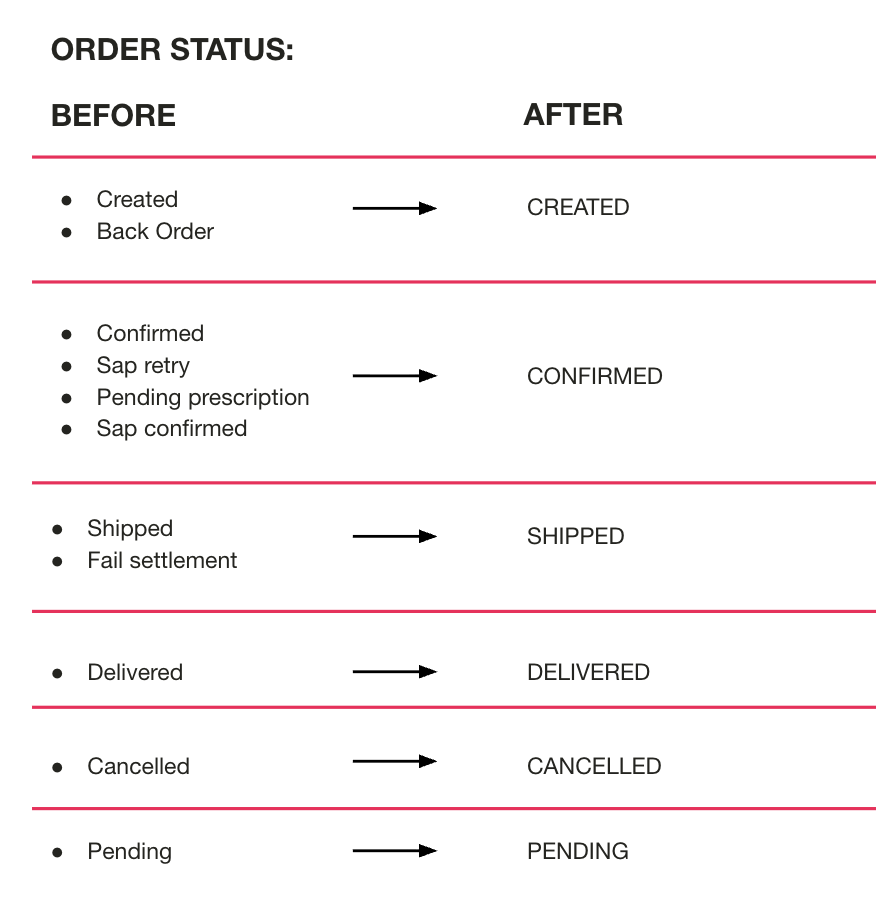
- Language Simplification: We discovered that the language used for order statuses was technical and confusing. I led the effort to redesign this terminology, collapsing complex backend codes into a short, user-friendly set of statuses.
THE SOLUTION
A unified hub for user autonomy
The outcome of a shared, evidence-based journey
The final design was an integrated self-service ecosystem designed to provide clarity and confidence to the user at every step of their post-purchase journey.
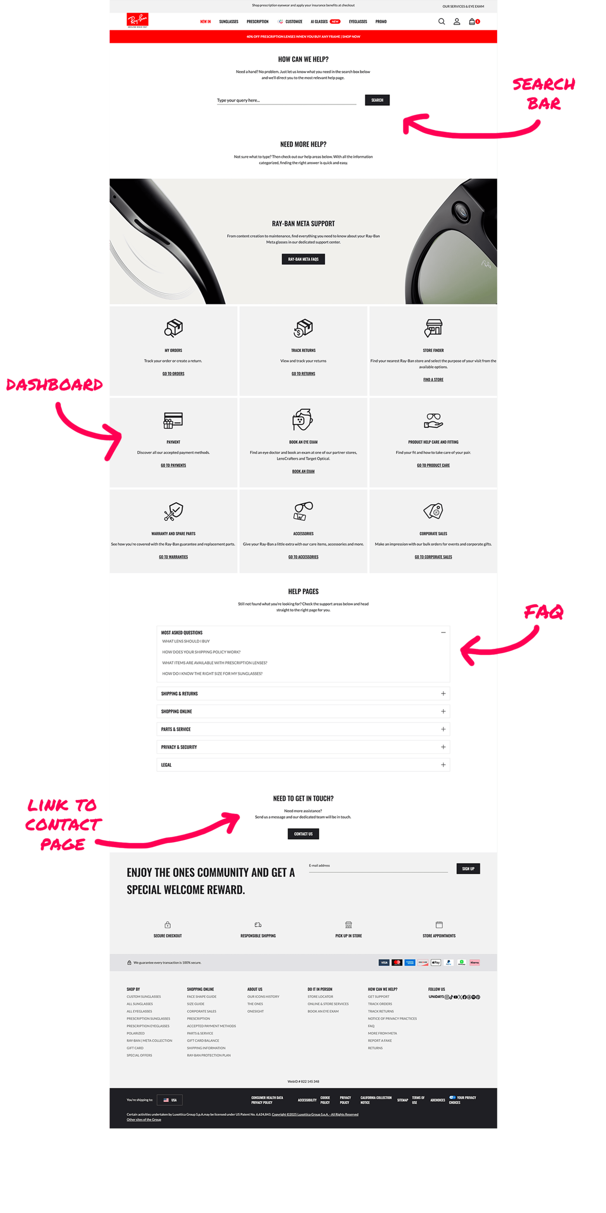
- A Central "Get Support" HubWe designed a single, clear entry point for all support needs, featuring a prominent search bar, a dashboard of common topics, and updated FAQs.
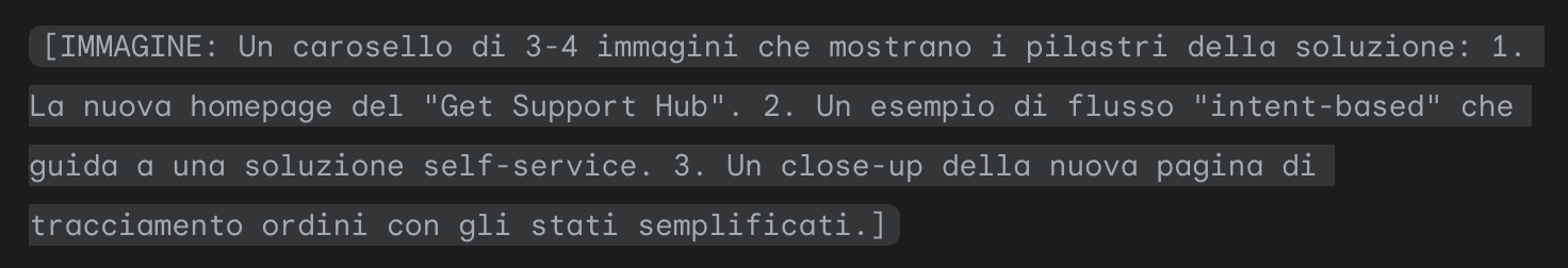
- Intent-Based Contact FlowsThe new design always presents the relevant self-service option first. For example, a user asking about a return is guided directly to the online return tool. Contact forms and chat options are presented only when a self-service path is not available.
- Simplified Order StatusesWe redesigned the order tracking page to use simple, plain language that users could understand at a glance: Created, Confirmed, Shipped, Delivered, Cancelled. This directly addressed a major source of confusion and repeat calls.
- Visible Support NavigationWe added clear, persistent links for "Get Support" and "Order Status" into the main website header, fixing the findability gap and making help accessible from anywhere.
THE IMPACT
Fewer calls, more autonomy, a scalable model
The redesign successfully shifted a significant portion of support requests from the call center to the self-service platform, resulting in improved efficiency for the business and a better experience for customers.
- -14% reduction in Customer Service requests in the primary market (United States).
- +9% more returns completed autonomously by users through the new self-service tool.
- Qualitative usability tests reported higher task success in navigation and better comprehension of the new order terminology.
The success of this intent-based model was so significant that it was later adopted as a blueprint for the support experience of Sunglass Hut, another major brand within the Luxottica group.t
KEY TAKEAWAYS
Design lessons from the post-purchase experience
This project provided three crucial lessons that have shaped my approach to design ever since.
- Start with the data you have.You don't always need new research to make a significant impact. A deep analysis of existing data, like a technical backlog, can be a powerful and efficient catalyst for change.
- Language is core UX design.Simplifying complex, internal terminology into a clear, user-facing vocabulary is not just a content task—it's a fundamental design decision. Clarity in language directly reduces user confusion and repeat contacts.
- Findability comes first.The most brilliant self-service tool is useless if no one can find it. Exposing clear entry points for help in the main navigation had a massive impact on user behavior, proving that the first click often shapes the entire journey.
KEY TAKEAWAYS
My approach to senior-level design
If you found this e-commerce optimization project interesting, see how I applied a similar data-driven approach to streamline the most critical step of the funnel.
COSTA DEL MAr
Transforming the PDP into a guided lens decision journey
E-COMMERCE OPTIMIZATION
UX RESEARCH
A/B TESTINGt

Or, see all my work

ABOUT ME
WORKS
CONTACTS
ray-ban · 2020 · web
Designing a self-service journey to empower customers
Ray-Ban's customer service was overloaded with calls for issues users could solve themselves. I led the redesign of the support experience, transforming it from a reactive call center into a proactive self-service ecosystem. By partnering with the Head of Customer Service to analyze user intents, we delivered a new, clear hub that significantly reduced support requests and empowered users to find solutions on their own.
-14%
Customer Service Requests
+9%
Autonomous Returns
THE CONTEXT
A support system overloaded with solvable problems
The post-purchase experience is fundamental for a brand like Ray-Ban. However, the customer service team was under immense pressure. An internal analysis revealed a critical inefficiency: 90% of all support requests arrived via phone, and a staggering 70% of those calls were for tasks users could have completed themselves, such as tracking an order or starting a return.
This created a negative loop: long wait times for customers and rising operational costs for the business. The existing online help tools were simply not visible, clear, or effective enough to break this cycle.
The original Ray-Ban customer support page
Our mission was to design for the user's intent, not the company's org chart.
MY ROLE
Bridging user experience and operational needs
As the Product Designer on this project, my role was to act as a strategic bridge. I worked in close partnership with the Head of Ray-Ban's Customer Service to dive deep into the real-world problems their team was facing. My responsibility was to translate these operational pain points and user intents into a clear information architecture and an intuitive interface that could effectively deflect routine requests and empower users to help themselves.
THE CHALLENGE
From call center data to a clear design strategy
Our approach was rooted in understanding the "why" behind every customer contact. We followed a three-step process to build our solution from the ground up:
- Intent Mapping: I collaborated with the Customer Service team to analyze and categorize the top contact reasons. This allowed us to map each user problem to the most efficient solution, whether it was a self-service tool or direct contact with an agent.
- Content & Flow Audit: I inventoried all existing support pages, FAQs, and self-service tools to identify gaps and inconsistencies. The goal was to consolidate scattered information into a single, coherent Help Center.
- Language Simplification: We discovered that the language used for order statuses was technical and confusing. I led the effort to redesign this terminology, collapsing complex backend codes into a short, user-friendly set of statuses.
THE SOLUTION
A unified hub for user autonomy
The final design was an integrated self-service ecosystem designed to provide clarity and confidence to the user at every step of their post-purchase journey.
- A Central "Get Support" HubWe designed a single, clear entry point for all support needs, featuring a prominent search bar, a dashboard of common topics, and updated FAQs.
- Intent-Based Contact FlowsThe new design always presents the relevant self-service option first. For example, a user asking about a return is guided directly to the online return tool. Contact forms and chat options are presented only when a self-service path is not available.
- Simplified Order StatusesWe redesigned the order tracking page to use simple, plain language that users could understand at a glance: Created, Confirmed, Shipped, Delivered, Cancelled. This directly addressed a major source of confusion and repeat calls.
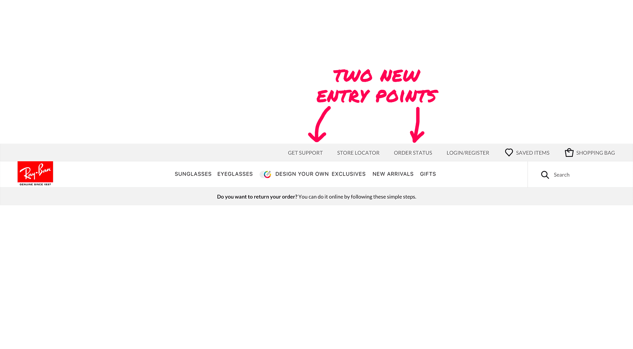
- Visible Support NavigationWe added clear, persistent links for "Get Support" and "Order Status" into the main website header, fixing the findability gap and making help accessible from anywhere.
THE IMPACT
Fewer calls, more autonomy, a scalable model
The redesign successfully shifted a significant portion of support requests from the call center to the self-service platform, resulting in improved efficiency for the business and a better experience for customers.
- -14% reduction in Customer Service requests in the primary market (United States).
- +9% more returns completed autonomously by users through the new self-service tool.
- Qualitative usability tests reported higher task success in navigation and better comprehension of the new order terminology.
The success of this intent-based model was so significant that it was later adopted as a blueprint for the support experience of Sunglass Hut, another major brand within the Luxottica group.t
KEY TAKEAWAYS
Design lessons from the post-purchase experience
This project provided three crucial lessons that have shaped my approach to design ever since.
- Design for the user's intent, not your org chart.The most effective solutions start by deeply understanding the user's problem. By mapping our design to the top contact reasons, we built a system that was inherently more intuitive and efficient.
- Language is core UX design.Simplifying complex, internal terminology into a clear, user-facing vocabulary is not just a content task—it's a fundamental design decision. Clarity in language directly reduces user confusion and repeat contacts.
- Findability comes first.The most brilliant self-service tool is useless if no one can find it. Exposing clear entry points for help in the main navigation had a massive impact on user behavior, proving that the first click often shapes the entire journey.
WHAT'S NEXT?
Continue the story
If you enjoyed this look into service design, let's go back to the core of e-commerce and see how I redesigned a product page to guide user decisions.
COSTA DEL MAr
Transforming the PDP into a guided lens decision journey
How context-first guidance boosted clarity, conversion, and loyalty
E-COMMERCE OPTIMIZATION
UX RESEARCH
A/B TESTINGt
Or, see all my work