ray-ban · 2016 · web
Optimizing the checkout for an e-commerce leader
Stakeholder debate and user confusion were causing Vista’s critical template journey to fail. I led a design process that replaced subjective opinions with objective data from A/B and usability tests. This evidence-based approach aligned the teams, built trust, and boosted the studio conversion rate by 9.1%.
+1.8%
Conversion Rate
-6%
First Step Drop-off
-1.1%
Validation Errors
THE CONTEXT
A crucial user journey, plagued by a lack of confidence
The checkout process presented multiple friction points. This was confirmed not only by an internal backlog of over 70 Jira tickets, but also by external criticism. During the project, I found an industry article that specifically highlighted Ray-Ban's checkout as a "bad example" for its mandatory login page, which forced users to choose between logging in or continuing as a guest.
Our internal findings supported this. The data showed that over 80% of our users chose to check out as guests , and less than 2% ever registered before the checkout. This initial barrier reflected a wider industry trend, with studies showing that 27% of users abandon checkouts they find too long or complicated. The need for a redesign was clear and urgent.
My role wasn't just to design the solution, but to design a process that could turn subjective opinions into objective, data-backed decisions.
MY ROLE
A designer eager to learn and apply foundational principles
As a Product Designer at the beginning of my career, this project was a formative experience. I was tasked with turning a daunting backlog of issues into tangible design solutions. Working in close collaboration with my manager, my role was to conduct an expert analysis, propose concrete improvements, and design the final UI and prototypes for both desktop and mobile.
THE CHALLENGE
Three doubts, three proofs: Earning stakeholder trust
After an initial design sprint defined our vision, the roadmap triggered significant doubts from stakeholders. I treated each challenge as an opportunity to build trust through a transparent, evidence-based approach.
- Transparency accelerates progress.Making design explorations visible and annotated in Figma doesn't just build trust, it makes the entire decision-making process faster and more efficient for everyone.
- A thorough review of known unresolved bugs from internal and external user tests, which we prioritized from a backlog of over 70 tickets.
- UX best practices from industry leaders like the Baymard Institute and the mobile-first principles advocated by Luke Wroblewski, combined with competitor benchmarks.
THE SOLUTION
The outcome of a shared, evidence-based journey
Based on the insights from our analysis, we identified and implemented four major enhancements to streamline the entire checkout experience:
- Make the cart page a mandatory step.This ensures users have full clarity on their order, shipping costs, and promo codes before committing to payment, aligning the desktop experience with mobile.
- Visible Payment OptionsWe reorganized the payment methods, giving prominence to the most used ones and making them all visible without requiring an extra click, reducing hesitation at the final step.
- Optimized FormsIntegrate Google Autocomplete Address API. We reduced the number of form fields in the delivery page by allowing users to type and select their address from a list, which then autocompletes the remaining fields, saving time and reducing errors.
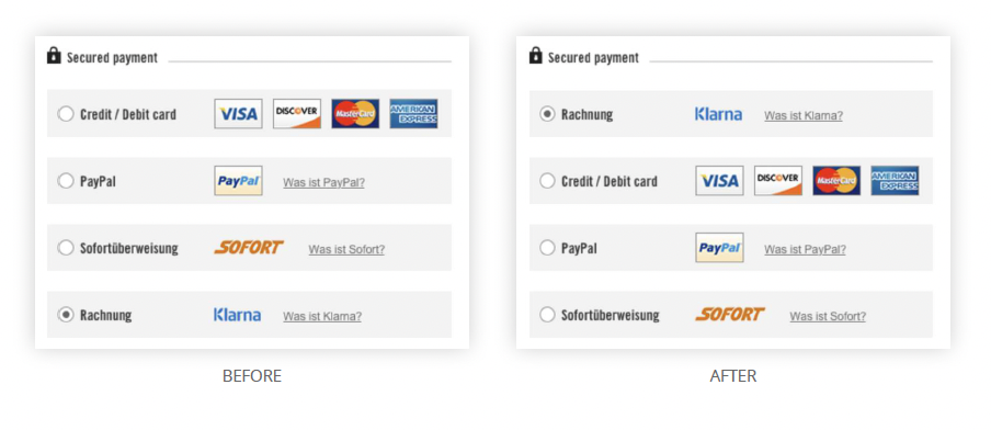
- Visible Payment OptionsChange payment methods ranking position. In the payment page, we reordered the payment methods based on their actual usage data for each specific country, giving prominence to the most popular options.
THE IMPACT
More than metrics: A cultural shift in design maturity
- +1.8% Conversion Rate, the most critical business metric.
- -12 seconds in the average time to complete the checkout.
- -1.1% in address validation errors, leading to a notable reduction in customer service calls for post-order address corrections.
This project was a turning point. Its success led to me becoming the go-to designer for checkout optimization across all major Luxottica e-commerce platforms, including Oakley, Sunglasshut, and Costa del Mar. We established a bi-annual process to review the backlog and implement continuous improvements, transforming a one-time project into a long-term strategic practice.
KEY TAKEAWAYS
The foundations of an evidence-based designer
This early-career project was fundamental in shaping my design philosophy and process.
- Start with the data you have.Teamwork is a superpower. Facing a huge amount of work in a short period, I learned that working side-by-side with a motivated team is the key to accomplishing anything. Trusting colleagues and asking for help is a strength.
- Stand on the shoulders of giants.Start with the data you have. You don't always need new research to make a significant impact. A deep analysis of existing data, like a technical backlog or analytics reports, can be a powerful and efficient catalyst for change.
- Holistic optimization wins.Stand on the shoulders of giants. Applying established, expert-backed principles from industry leaders is a low-risk, high-impact way to solve common usability problems and build a foundation for evidence-based design.
This project solidified my belief that a Senior Designer's greatest impact comes from shaping the process, not just the pixels.
KEY TAKEAWAYS
My approach to senior-level design
If you found this e-commerce optimization project interesting, see how I applied a similar data-driven approach to streamline the most critical step of the funnel.
VISTA
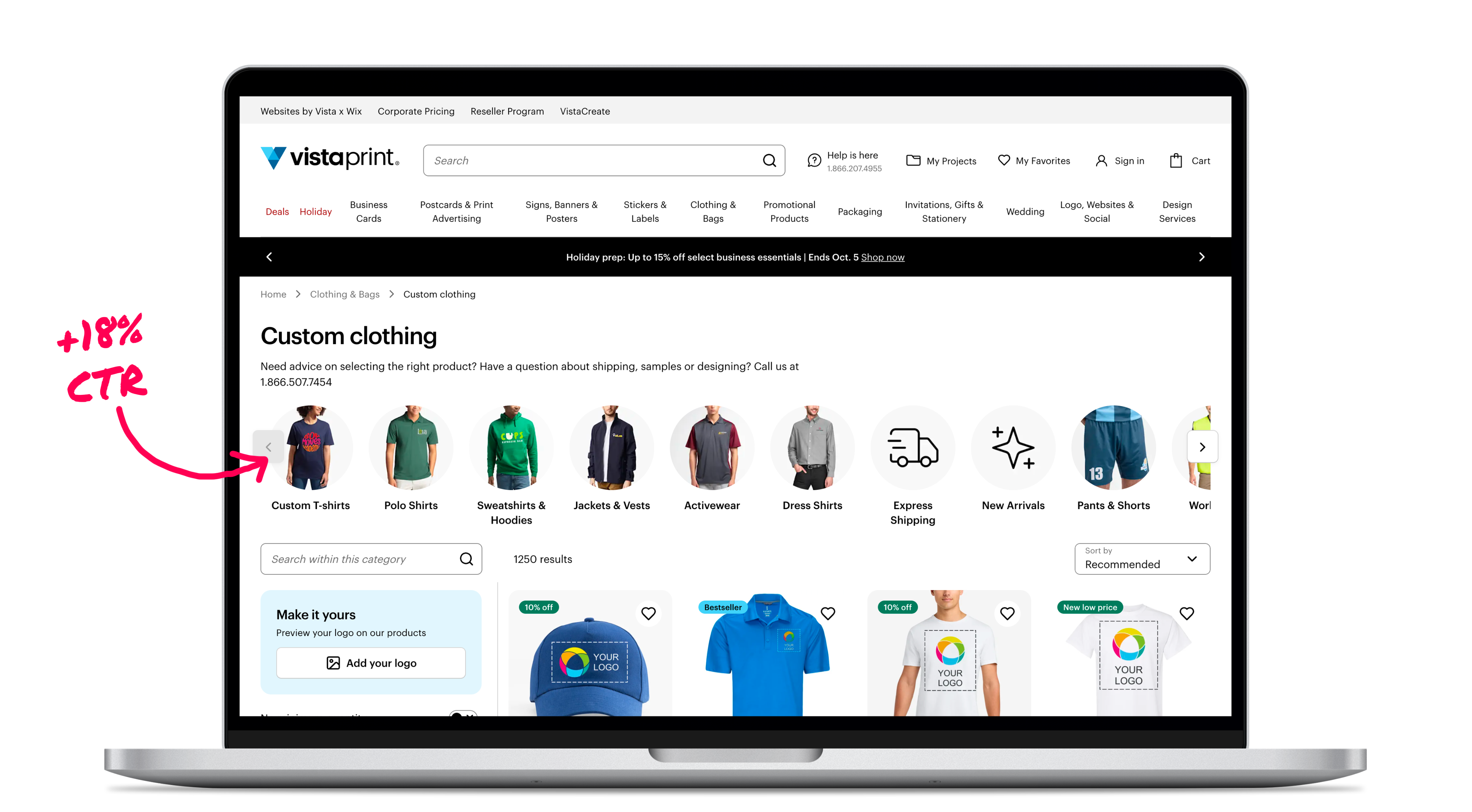
Rebuilding PLP navigation for faster product discovery
NAVIGATION DESIGN
USER TESTING
STAKEHOLDER MANAGEMENT
Or, see all my work
ABOUT ME
WORKS
CONTACTS
ray-ban · 2016 · web
Optimizing the checkout for an e-commerce leader
In 2016, the Ray-Ban checkout was slowed down by over 70 known friction points documented in a large backlog. As a Product Designer at the start of my career, this was the first big project I handled on my own. I worked with my manager to transform this backlog into an action plan, applying foundational usability principles to deliver a holistic redesign that significantly improved conversion, reduced user errors, and simplified the path to purchase.
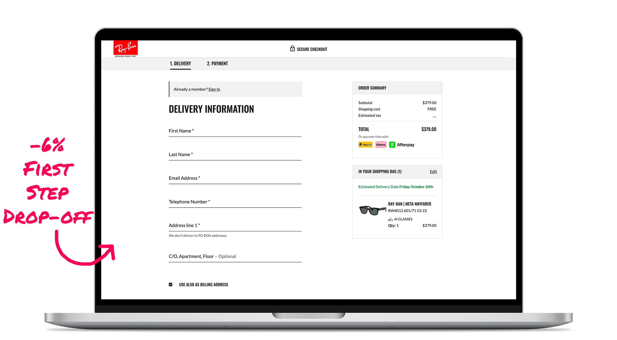
+1.8%
Conversion Rate
-6%
First Step Drop-off
-1.1%
Validation Errors
THE CONTEXT
A checkout slowed by known friction and public criticism
The checkout process presented multiple friction points. This was confirmed not only by an internal backlog of over 70 Jira tickets, but also by external criticism. During the project, I found an industry article that specifically highlighted Ray-Ban's checkout as a "bad example" for its mandatory login page, which forced users to choose between logging in or continuing as a guest.
Our internal findings supported this. The data showed that over 80% of our users chose to check out as guests , and less than 2% ever registered before the checkout. This initial barrier reflected a wider industry trend, with studies showing that 27% of users abandon checkouts they find too long or complicated. The need for a redesign was clear and urgent.
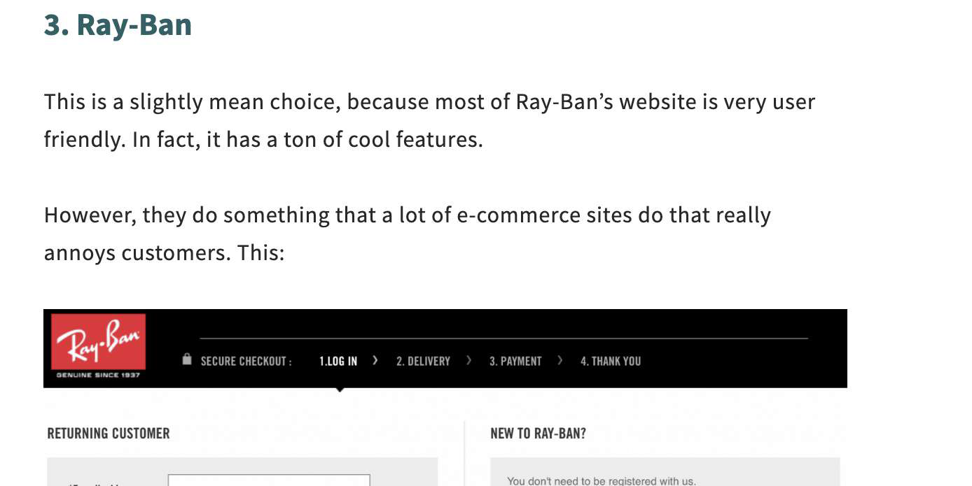
The industry article that highlighted Ray-Ban's checkout as a "bad example"
Inspired by mobile-first pioneers, our mission was to eliminate every moment of doubt.
MY ROLE
A designer eager to learn and apply foundational principles
As a Product Designer at the beginning of my career, this project was a formative experience. I was tasked with turning a daunting backlog of issues into tangible design solutions. Working in close collaboration with my manager, my role was to conduct an expert analysis, propose concrete improvements, and design the final UI and prototypes for both desktop and mobile.
THE CHALLENGE
From a backlog of issues to a clear action plant
Our approach was a methodical analysis of all available data and expert knowledge, rather than new user research. We gathered every piece of information we could to build a comprehensive action plan.
Our inputs included:
- Insights from the analytics team and winning solutions from previous A/B tests.
- A thorough review of known unresolved bugs from internal and external user tests, which we prioritized from a backlog of over 70 tickets.
- UX best practices from industry leaders like the Baymard Institute and the mobile-first principles advocated by Luke Wroblewski, combined with competitor benchmarks.
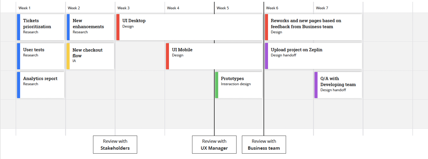
The 7-week project timeline, from research and prioritization to final design handoff
THE SOLUTION
Four fundamental improvements for a seamless flow
Based on the insights from our analysis, we identified and implemented four major enhancements to streamline the entire checkout experience:
- Make the cart page a mandatory step.This ensures users have full clarity on their order, shipping costs, and promo codes before committing to payment, aligning the desktop experience with mobile.
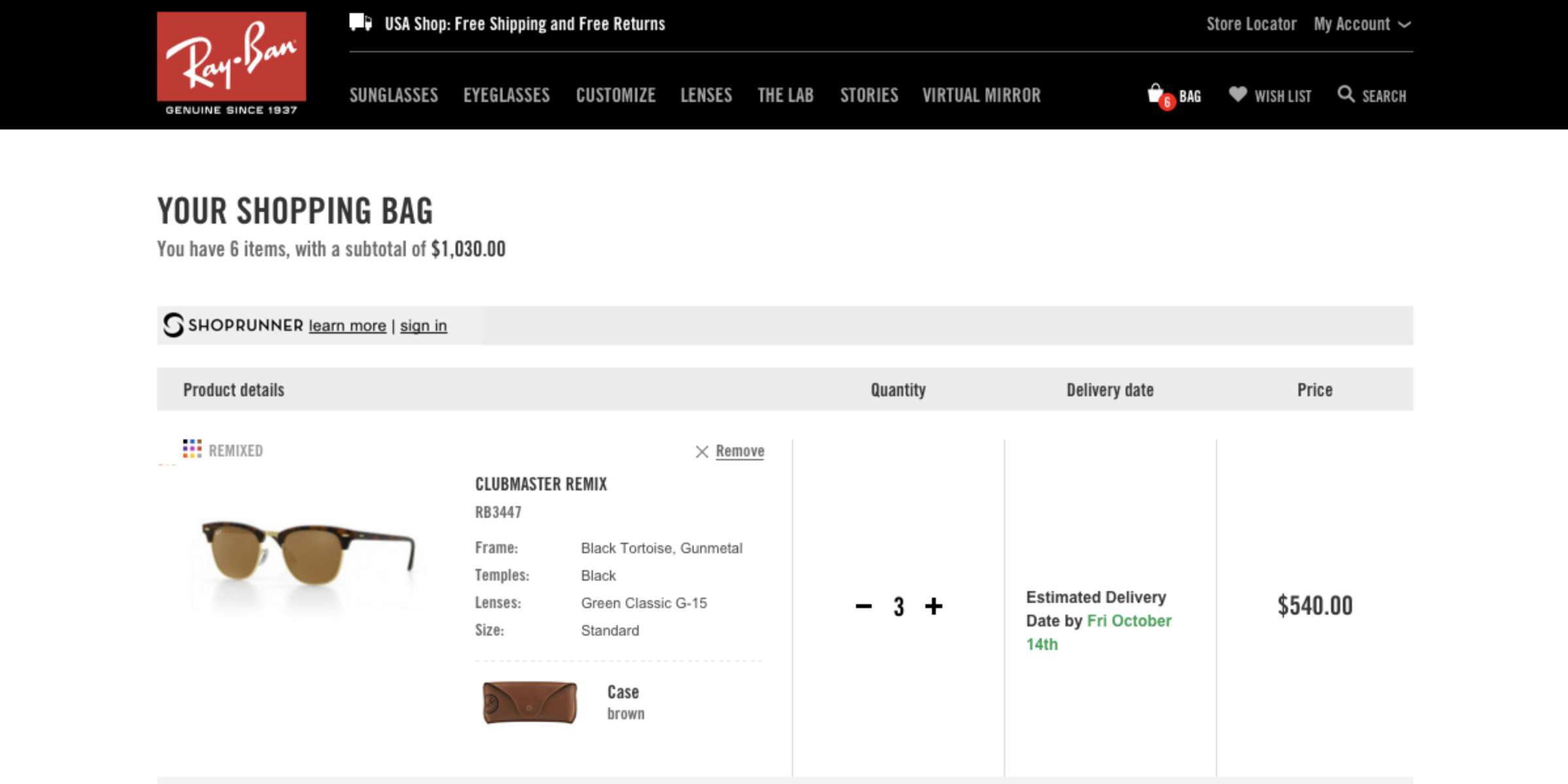
The shopping bag, now a mandatory first step for clarity
- Remove the initial login page.Since over 80% of users check out as guests, this barrier was removed to speed up the process. Users can now log in directly on the delivery page or create an account after the purchase is complete.
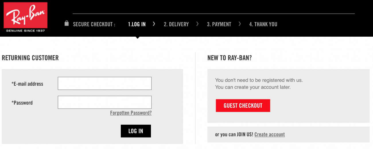
The original login wall, a major friction point that was removed
- Integrate Google Autocomplete Address API.We reduced the number of form fields in the delivery page by allowing users to type and select their address from a list, which then autocompletes the remaining fields, saving time and reducing errors.
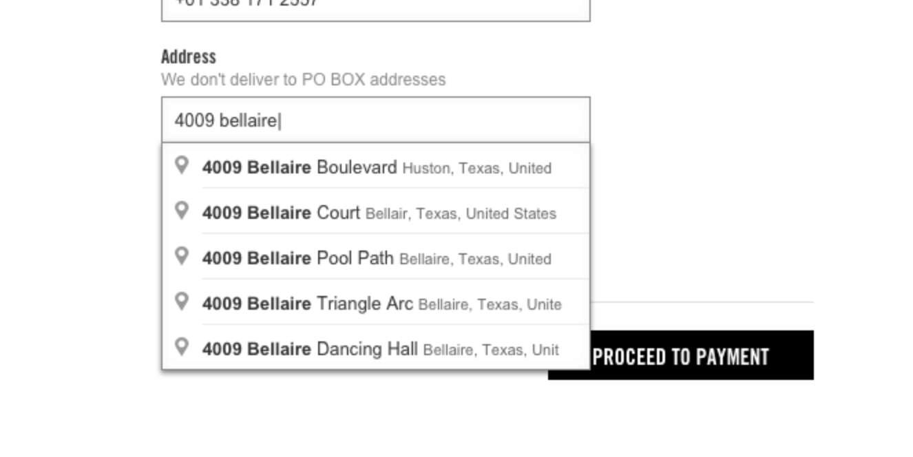
The new Google Autocomplete API to speed up address form completion

Reordering payment methods based on actual usage data
- Change payment methods ranking position.In the payment page, we reordered the payment methods based on their actual usage data for each specific country, giving prominence to the most popular options.
THE IMPACT
Faster, clearer, and better for everyone
The holistic optimization of the checkout delivered significant and measurable improvements across the board, validating our methodical approach.
We also received a lot of positive feedback on how simple and fast the new checkout was from several user tests we did in the following weeks.
- +1.8% uplift in the overall conversion rate.
- -6% drop-off at the first step of the checkout process.
- -1.1% in address validation errors, which led to a notable reduction in customer service calls for post-order address corrections.
This project was a turning point. Its success led to me becoming the go-to designer for checkout optimization across all major Luxottica e-commerce platforms, including Oakley, Sunglasshut, and Costa del Mar. We established a bi-annual process to review the backlog and implement continuous improvements, transforming a one-time project into a long-term strategic practice.

Sharing my learnings in a talk titled "Design a checkout that doesn't piss you off"
KEY TAKEAWAYS
The foundations of an evidence-based designer
This early-career project was fundamental in shaping my design philosophy and process.
- Teamwork is a superpower.Facing a huge amount of work in a short period, I learned that working side-by-side with a motivated team is the key to accomplishing anything. Trusting colleagues and asking for help is a strength.
- Start with the data you have. You don't always need new research to make a significant impact. A deep analysis of existing data, like a technical backlog or analytics reports, can be a powerful and efficient catalyst for change.
- Stand on the shoulders of giants. Applying established, expert-backed principles from industry leaders is a low-risk, high-impact way to solve common usability problems and build a foundation for evidence-based design.
WHAT'S NEXT?
Continue the story
If you appreciated how I removed friction from the end of the funnel, see how I tackled the challenge of product discovery at the very beginning.
VISTA
Rebuilding PLP navigation for faster product discovery
How prototypes and testing cut friction and drove more traffic into PDPs
NAVIGATION DESIGN
USER TESTING
STAKEHOLDER MANAGEMENT

Or, see all my work